Shopify Product Page Optimization: Maximize Conversions 2026

You're probably looking at one of your Shopify product pages right now thinking some version of this: the product is good, traffic is coming in, but the page still feels weaker than it should. Maybe it looks fine. Maybe you already changed the button color, rewrote a few lines, added an app or two, and still didn't get the lift you expected.
That's normal. Most stores don't have a product page design problem. They have a priority problem.
Shopify product page optimization works best when you stop treating the page like a design canvas and start treating it like a sales system. The right workflow is usually simple. Fix what blocks buying first. Tighten the message. Improve media. Clean up the technical layer. Then test small changes on pages that already get traffic.
A lot of store owners get buried under advice that sounds useful but doesn't tell them what to do first. This guide is the version I'd give a merchant who wants a practical sequence, not a bloadsheet of random tips. It's built for real stores, real trade-offs, and the reality that AI tools can speed up the work if you use them well.
Table of Contents
- Why Your Product Page Is Your Most Important Asset
- The Foundation Compelling Copy and On-Page Elements
- Visual Storytelling Image and Media Optimization
- The Technical Backbone Speed Schema and Structure
- Advanced Growth Levers Variants Internal Links and Global SEO
- Your Prioritized Audit and Testing Roadmap
Why Your Product Page Is Your Most Important Asset
A Shopify product page isn't just a place to store product information. It's the moment where a shopper decides whether your store feels trustworthy, your product feels right, and the purchase feels easy enough to complete.
That's why small cosmetic tweaks often disappoint. A new icon set won't rescue a page with weak images, vague copy, hidden shipping information, or an add-to-cart area that disappears on mobile. Buyers don't need more decoration. They need fewer reasons to hesitate.
Shopify's own guidance puts the priorities in the right order: CTA visibility, product imagery, descriptions, reviews, and mobile usability should come first, and merchants should improve high-traffic pages first, test one change at a time, and scale what works with analytics, according to Shopify's product page advice. That's the right mental model. Product pages are conversion assets, not just brand pages.
Practical rule: If a shopper lands on your page and can't quickly answer “What is this, why should I trust it, and how do I buy it?” the page isn't finished.
The strongest pages usually do three jobs well:
- Reduce uncertainty: They show enough detail that a buyer can picture what will arrive.
- Lower friction: They keep the purchase path obvious and uncluttered.
- Support confidence: They surface proof, policies, and product context where the buyer needs them.
This is also where AI can help without taking over. AI is useful for drafting descriptions, generating alt text, clustering FAQ themes, and identifying missing on-page elements. It's far less useful if you let it produce generic copy that sounds polished but says nothing.
If your page feels messy, don't rebuild everything at once. Start with the decisions a buyer has to make. Then support those decisions in the order they happen.
The Foundation Compelling Copy and On-Page Elements
The fastest way to improve a weak product page is usually not code. It's better merchandising on the page itself. Titles, descriptions, reviews, trust cues, and the add-to-cart area do most of the persuasion.
Start with the first screen
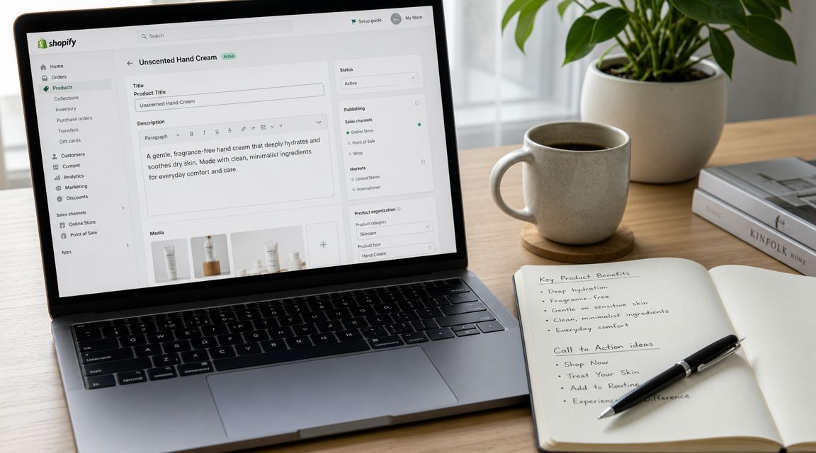
What a shopper sees before they scroll matters more than many merchants realize. The top of the page should make the product legible immediately. That means a clear title, sharp primary image, visible price, obvious variant selection if relevant, review signal, and an add-to-cart button that doesn't compete with visual noise.
Reviews matter here because they answer the silent question every buyer asks: “Has anyone else bought this and been happy with it?” According to this Shopify-focused product page checklist, products with 10 or more reviews convert 52% higher than products with zero reviews, and pages with at least four images convert 28% better than pages with only one or two. Those numbers line up with what most merchants see in practice. Social proof and visual depth reduce hesitation.
A quick gut check for the top section:
- Title clarity: Use product names people can understand without decoding your brand language.
- Rating visibility: Put star ratings near the title if you have them.
- CTA prominence: Keep the purchase action obvious and visually stronger than secondary links.
- Trust reinforcement: Place shipping, returns, or guarantee information close enough to support the buying action.
Write for decisions, not for word count
Many product descriptions fail because they read like inventory records. They list specs without helping someone decide.
Weak copy:
- 12 oz ceramic mug
- Dishwasher safe
- Matte finish
- Wide handle
Stronger copy:
- Keeps your drink stable on your desk and comfortable in hand
- Matte exterior improves grip
- Wide handle gives you a more secure hold
- Easy to clean after daily use
The underlying features didn't change. The framing did.
Descriptions should be easy to scan. Use short paragraphs, bullets, and subheads. On mobile, dense blocks of text get skipped. Buyers usually look for a few specific things: what problem this solves, who it's for, what it feels like, how it fits or works, and what they need to know before ordering.
A simple structure works well:
| Element | What it should do |
|---|---|
| Opening lines | State the main benefit and use case |
| Bullet list | Surface key features in plain language |
| Details section | Handle materials, sizing, ingredients, care, or specs |
| FAQ or accordions | Answer objections without cluttering the page |
Meta titles and meta descriptions matter too, especially when product pages rank or get impressions in search. Write them for clicks, not just indexing. A clear product type, differentiator, and brand signal usually beats clever wording.
Buyers rarely abandon because your copy wasn't poetic enough. They leave because the page didn't answer the questions that mattered to them.
Use AI as a draft partner, not a final approver
AI can save serious time on product page copy if you use it with constraints. Give it the product facts, your tone, customer pain points, common objections, and banned phrases. Ask it to produce multiple versions of benefit-led copy, FAQ candidates, and meta descriptions. Then edit aggressively.
Use AI for:
- First drafts of product descriptions
- Alternative headline options
- FAQ extraction from support tickets
- Review theme summaries
- Meta tag variations
Don't use AI for:
- Publishing unedited manufacturer-like copy
- Inventing claims your product can't support
- Writing in a generic voice that sounds like every other store
If you only fix one thing in this section, fix clarity. A clear page with modest design often outperforms a beautiful page that makes people think too hard.
Visual Storytelling Image and Media Optimization
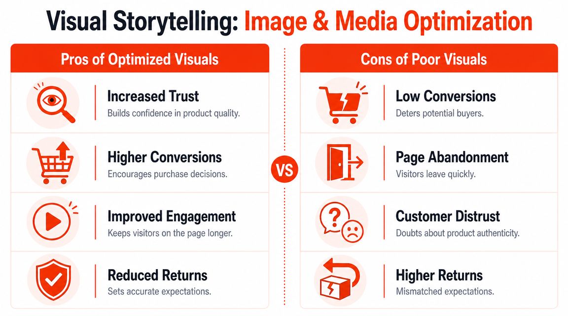
Most shoppers can't touch your product. Your media has to replace that missing physical experience. That's why Shopify product page optimization isn't just about adding prettier photos. It's about helping people inspect, compare, and confirm what they're buying.
Show the product the way buyers inspect it
Good product media answers practical questions. What does it look like from the side? How big is it in real life? What texture does it have? What changes across variants? What does it look like in use?
Expert guidance on Shopify product pages recommends treating media as a conversion system. That includes zoomable, high-resolution images, visual variant support, and a visible Add to Cart button, while avoiding the mistake of pushing purchase-critical information below the fold on mobile, as noted in On Tap Group's product page optimization guidance.
A healthy media set usually includes a mix of:
- Clean product shots: Front, side, back, detail, packaging if relevant
- Context images: Lifestyle or in-use scenes that show scale and fit
- Decision media: Close-ups of texture, seams, ingredients, ports, materials, or finish
- Short-form video: Demonstrations, unboxing, try-on, assembly, or movement
If you sell apparel, presentation matters even more. Stores using flat lays or inconsistent cutouts often struggle to make products feel premium. If you're evaluating better merchandising visuals, it's worth reviewing tools that compare AI ghost mannequin solutions, especially if your catalog is large and traditional shoots are slowing you down.
Balance visual richness with mobile speed
More media isn't always better. Better media is better.
The primary trade-off is confidence versus load time. A product gallery full of oversized images, autoplay video, and extra scripts can make the page feel expensive on desktop and frustrating on mobile. That's a common failure point. Merchants add assets to increase confidence and accidentally slow the page enough to hurt buying momentum.
A practical way to view this:
| Media choice | Usually helps when | Usually hurts when |
|---|---|---|
| More product angles | Product has important physical details | Images repeat the same view |
| Lifestyle images | Buyer needs context or scale | They overwhelm the gallery before core product views |
| Video | Product benefits from motion or demo | File weight and placement delay core content |
| Rich galleries | Variants need visual confirmation | Mobile users must scroll too far to reach the CTA |
If your current gallery is bloated, start by cleaning it up before adding new assets. This guide on how to optimize Shopify images is useful for tightening delivery without stripping the page of its selling power.
Make variant selection visually obvious
Variant confusion kills confidence fast. If a shopper selects “Forest,” the main image should update to show that exact color. If they choose a bundle, finish, or size with visible differences, the gallery should confirm it right away.
A buyer shouldn't have to guess whether the variant they selected matches the image they're seeing.
This matters on mobile even more because the screen gives you less room to explain mistakes away. If the selected option doesn't visibly update, some shoppers hesitate and some abandon. Others buy anyway and create support tickets or returns later.
AI can help here too, especially for catalog operations. It can group similar image sets, suggest missing alt text, identify inconsistent filenames, and flag products where variants don't appear to have dedicated visuals. But the decision standard stays human: every visual should earn its place by making the buying decision easier.
The Technical Backbone Speed Schema and Structure
A product page can look excellent and still underperform if the technical layer is sloppy. Slow pages frustrate shoppers. Weak structure makes crawling harder. Missing schema limits how clearly search engines can interpret the page.
This is the part many merchants postpone because it feels less visible. That's a mistake. Technical quality supports every other improvement you make.
Audit in the right order
Start with a sequence, not a random checklist. A standard Shopify workflow is to measure mobile and desktop speed, inspect media weight, then validate schema, according to TinyIMG's Shopify product SEO guidance. The same source recommends keeping hero images under 200 KB and gallery images under 100 KB while still using descriptive alt text.
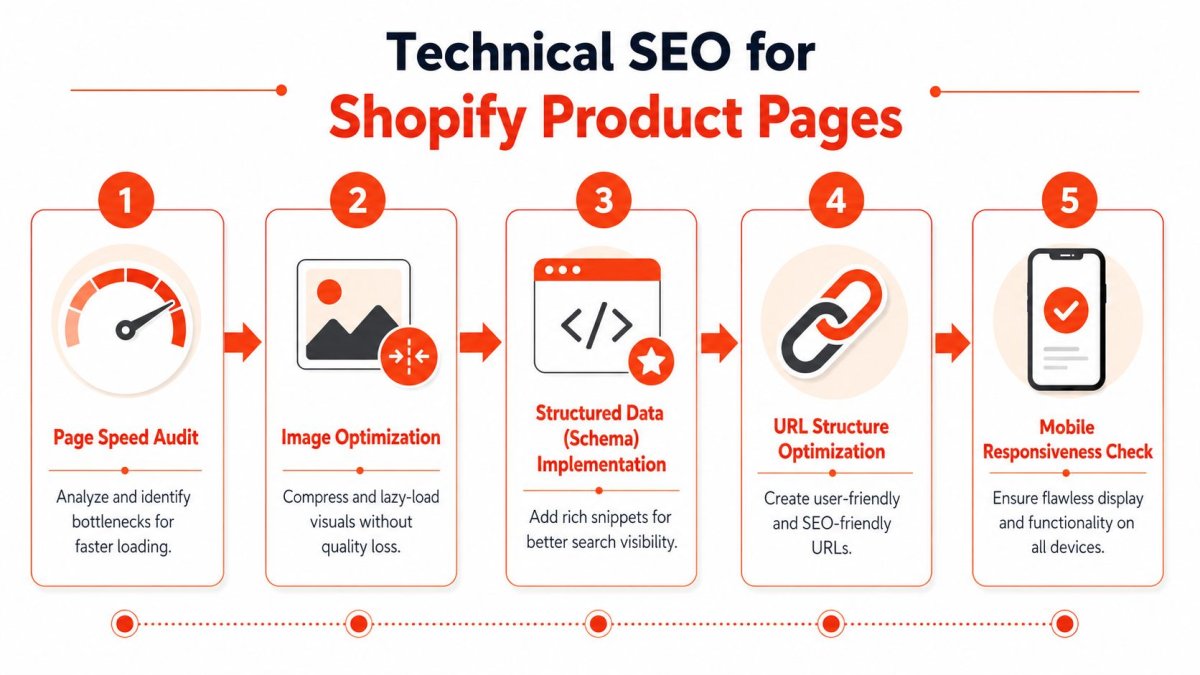
That order works because speed problems often start with media and app weight. If you jump straight into metadata while the page still loads poorly on mobile, you're polishing a bottleneck.
A practical audit looks like this:
- Check speed by device: Mobile first, because that experience usually breaks first.
- Review asset weight: Large hero images, duplicate galleries, embedded media, app scripts.
- Inspect what's above the fold: Make sure title, price, variants, CTA, and trust cues aren't buried.
- Validate structured data: Product and FAQ schema where appropriate.
- Review indexability and duplication risk: Canonicals, variant URL behavior, internal linking.
For a deeper technical framework, this walkthrough on technical SEO for ecommerce is a solid reference point.
Here's a useful explainer before you get too deep into fixes:
Schema and structure should support trust
Schema isn't magic. It doesn't turn a weak product page into a strong one. What it does is help search engines interpret the page more clearly.
For product pages, the main priorities are usually Product schema and, where relevant, FAQ schema. If your page includes real FAQs, return details, shipping context, availability, and consistent product information, structured data helps reflect that cleanly. The same is true for organized page structure. Use headings logically, keep key details easy to access, and avoid hiding essential purchase information in hard-to-find tabs.
A technically sound product page also needs clean URL logic. Variant handling gets messy fast on Shopify if you let every option create confusion for crawlers or shoppers. The goal is simple: preserve a clear main page signal while making variant selection easy for users.
Technical SEO should make the page easier to understand for both bots and buyers. If a fix only serves one and harms the other, it's probably the wrong fix.
Use AI to accelerate repetitive technical work
AI is especially useful on the technical side when the task is repetitive but high volume. Think bulk alt text drafts, schema checks, title and meta consistency reviews, FAQ formatting, and identifying pages with missing content blocks.
What AI won't do well on its own is choose business trade-offs. It can suggest compressing everything. You still have to decide which visual assets are critical to conversion. It can flag duplicate-looking content. You still have to decide whether variants deserve separate treatment or should live under one product page.
The stores that get the most from AI use it to reduce manual work, not replace judgment.
Advanced Growth Levers Variants Internal Links and Global SEO
Once the basics are solid, growth usually comes from store architecture decisions rather than another round of micro-copy edits. It is in this area that many Shopify stores leave easy wins on the table.
Choose a variant strategy on purpose
Variants affect both SEO and usability. There isn't one universal answer because the right setup depends on how different the variants really are.
If your variants are mostly cosmetic, like color changes with the same buyer intent, one strong canonical product page is usually cleaner. It keeps authority consolidated and avoids creating thin, near-duplicate pages that compete with each other.
If a variant changes search intent or purchase logic, a separate page can make sense. Examples include materially different sizes, flavors, bundles, or product types where the shopper expects unique content, imagery, or use cases.
Use this decision frame:
- Keep variants unified when the main difference is visual and the buying journey is shared.
- Split them out when the product deserves different titles, different queries, different media, or different objections handled on-page.
- Avoid half-measures where variants act like separate products for users but remain vague for search engines.
The common failure isn't picking the “wrong” model. It's drifting into inconsistency across the catalog.
Internal links should help both crawling and buying
Internal linking is one of the simplest ways to strengthen important product pages. But random “related content” blocks don't do much if they lack context.
The strongest internal links usually come from:
- Collection pages with clear category relevance
- Buying guides that compare options
- Blog posts answering pre-purchase questions
- Support content that addresses objections
- Related product modules with real purchase logic
A store selling skincare, for example, shouldn't just link from a blog post to a cleanser product. It should link from a routine guide, ingredient explainer, or skin-concern article where the product solves the problem being discussed.
Related-product merchandising also affects revenue, not just navigation. If you want ideas for using complementary recommendations to increase Shopify average order value, that resource is worth reviewing because it focuses on relevance rather than clutter.
Global SEO needs localization, not just translation
International growth often stalls because merchants translate text but keep the same selling logic everywhere. That usually isn't enough.
Different markets care about different details. Sizing language, shipping expectations, spelling, product terminology, and trust cues all shift. A translated page that still reads like it was written for another market can rank poorly and convert poorly.
For Shopify Markets stores, the practical approach is:
| Area | Good localization looks like |
|---|---|
| Product copy | Native phrasing, not literal translation |
| Metadata | Search language matched to the market |
| FAQs | Local objections, delivery expectations, returns context |
| Currency and offers | Clear, market-appropriate presentation |
| Internal linking | Collections and content relevant to the local buyer journey |
AI can help create first-pass localized drafts, but native review still matters. Especially on product pages, the wrong nuance can make a page sound machine-made fast.
Your Prioritized Audit and Testing Roadmap
Most stores don't need more ideas. They need a sequence they can practically follow.
That sequence should start with pages that already matter. Shopify itself recommends improving the highest-traffic pages first and testing one change at a time on product pages, as noted earlier. That approach keeps the work measurable and prevents the common mistake of changing ten things at once and learning nothing.
Fix these first
Use this triage order:
- Blocking issues: Slow mobile load, broken variant-image behavior, hidden CTA, missing trust details, confusing pricing or stock signals.
- Core persuasion gaps: Weak title, generic description, poor gallery, no visible reviews, unclear FAQs.
- Technical weaknesses: Heavy media, missing structured data, duplication issues, weak internal links.
- Growth opportunities: Better recommendations, global localization, higher-intent content links, testing new layouts.
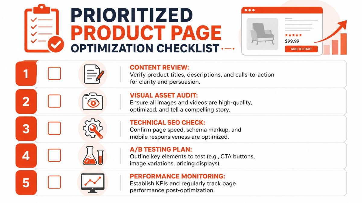
If you need a measurement setup before testing, this guide to Google Analytics 4 for Shopify can help you tighten tracking around product-page behavior.
Then test what can compound
Once the page is functional and trustworthy, start testing the elements that can produce repeatable gains across the catalog. Usually that means headlines, image order, CTA treatment, review placement, accordions, FAQ visibility, or recommendation modules.
Don't test randomly. Test one meaningful change at a time, especially on higher-traffic products. If you want a practical framework, these A/B testing best practices are useful for keeping experiments disciplined instead of anecdotal.
The best product page optimization program isn't the one with the longest checklist. It's the one that helps you learn what changed buyer behavior and then scale that learning.
AI fits into this roadmap best as an accelerator. Use it to draft copy variations, summarize reviews, generate FAQ ideas, identify missing assets, and prepare test candidates faster. Then let analytics and actual store performance decide what stays.
You do not need to rebuild your whole store this week. You need to fix what's costing you sales today, then keep improving in a way you can measure.
If you want help turning this into an actual workflow, wRanks gives Shopify merchants one place to audit product pages, generate better SEO content, add schema, improve image alt text, monitor rankings, and prioritize fixes without slowing the storefront. It's built specifically for Shopify, which makes it useful when you want faster execution instead of another disconnected SEO tool.

About Amira Hassan
Digital growth consultant specializing in AI-powered commerce strategies. Amira bridges the gap between cutting-edge AI tools and practical Shopify store growth.