Optimize Shopify Images: Speed & SEO Guide 2026

Your store probably looks good and still feels slow. Product pages are packed with sharp photography, collection grids are clean, and your brand finally feels premium. Then you check performance, or worse, you browse your own site on a phone, and the experience drags.
That's usually where Shopify image work goes wrong. Merchants treat it like a design task, or a one-time cleanup, when it's really an operating system for how media gets prepared, delivered, described, and monitored. If you only compress a few files and call it done, you haven't fixed the problem. You've patched symptoms.
The good news is you don't have to choose between beautiful images and a fast store. You can have both. The practical advice in DesignStack's image optimisation guide lines up with what works on Shopify too: right-size files before upload, use sensible formats, and stop making browsers do unnecessary work.
Table of Contents
- Why Your Shopify Images Are Slowing You Down
- Choosing the Right Format and Dimensions
- Compressing Images Without Losing Quality
- Mastering Image SEO and Alt Text at Scale
- Implementing Lazy Loading and Responsive Images
- Testing and Monitoring Your Image Performance
- Shopify Image Optimization FAQs
Why Your Shopify Images Are Slowing You Down
Many Shopify stores feel slow even when the design looks polished. The usual culprit is not the number of images. It is the image workflow.
A hero banner gets uploaded at a size meant for a desktop mockup, not a storefront. Product photos come straight from a camera roll or supplier pack. The theme scales them down visually, so the page looks fine in the editor. The browser still downloads the heavy original files, especially on mobile connections where the waste is harder to hide.
That creates a pattern I see all the time on larger catalogs. One oversized image rarely kills performance by itself. Hundreds of inconsistent uploads do. Collection pages, product galleries, promo tiles, badges, blog thumbnails, and app blocks all compete for bandwidth, and the store starts to feel sluggish before anyone can point to a single obvious failure.
Oversized images are one of the most common self-inflicted performance problems on Shopify.
Store teams also get trapped by a bad assumption. They treat quality and speed like opposites. Well-prepared images usually look better because they were sized, compressed, and delivered for the slot they are meant for, not forced into place after upload. DesignStack's image optimisation guide makes the same practical point from a broader web performance angle. Good image prep improves clarity and reduces waste at the same time.
The solution requires an operational shift. Image optimization is not a one-off design task anymore. It is an ongoing workflow that touches merchandising, SEO, accessibility, and performance review. If your catalog is small, manual cleanup can hold for a while. If you manage hundreds or thousands of SKUs, manual processes break fast. Naming gets sloppy, alt text gets skipped, new assets ignore format rules, and a few careless uploads erase earlier gains.
Treat Shopify image optimization like a pipeline. Prepare files before upload. Serve the right asset for the device. Keep alt text and filenames consistent. Then monitor the store so new images do not gradually drag performance back down. That is how stores stay fast after launch, not just during one cleanup sprint.
Choosing the Right Format and Dimensions
The first mistake happens before upload. Merchants ask, “Should this be JPEG or PNG?” when the better question is, “What job does this image need to do?” Format follows purpose.
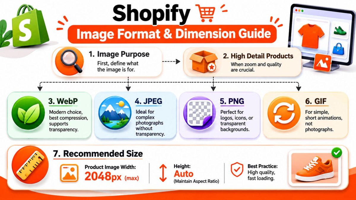
Start with purpose, not file type
For standard product photography, Shopify-oriented guidance repeatedly points to a 2048 × 2048 pixel ceiling in a square format as the practical balance between zoom-ready detail and page-speed control, and that same guidance notes that Shopify automatically serves WebP when supported in modern browsers, as explained in Codersy's Shopify image optimization checklist.
That guideline matters because it kills two bad habits at once.
First, it stops merchants from uploading giant originals “just in case.” Second, it forces consistency across product grids. If your catalog uses mixed aspect ratios without a reason, collection pages usually look messy and themes work harder to contain them.
Here's the framework that works in practice:
- Product photos: Use a consistent aspect ratio. For most catalogs, square images are the safest default.
- Logos and interface graphics: Keep transparency when you need it.
- Lifestyle banners: Size for their real placement, not for the dimensions of the source shoot.
- Animations: Use them sparingly. Decorative motion often costs more than it gives back.
Practical rule: Export at the exact display size you need, or roughly double that for retina displays. Don't upload oversized originals and expect the browser to clean up the mess.
A practical format decision table
There's no single best format. There's a best format for the use case.
| Format | Best For | Transparency | File Size | Key Consideration |
|---|---|---|---|---|
| JPEG | Product photos, lifestyle photography, blog visuals | No | Typically efficient for photographic images | Good workhorse when transparency isn't needed |
| PNG | Logos, icons, graphics with transparent backgrounds | Yes | Usually heavier than photo-first formats | Use it when transparency or crisp graphic edges matter |
| WebP | Most store images, including photos and many graphics | Yes | Commonly recommended for smaller files with strong visual quality | Strong default for modern storefront delivery |
| AVIF | Stores pursuing more aggressive modern-format workflows | Yes | Often treated as a highly efficient modern option qualitatively | Workflow and compatibility decisions need testing in your theme stack |
A few blunt calls:
- Use WebP for most store images if your workflow supports it cleanly.
- Use JPEG when you're handling standard photographic assets and want a simple, widely understood format upstream.
- Use PNG only when transparency is required, such as logos or interface assets.
- Use GIF only for simple short animations, not product photography.
The worst workflow is still common. Merchants upload a huge PNG because “quality matters,” then the theme shrinks it visually, mobile users download unnecessary weight, and everyone wonders why collection pages lag.
If you're trying to optimize Shopify images, dimensions matter as much as format. The right file type won't save a badly sized asset.
Compressing Images Without Losing Quality
Compression is where many teams either overdo it or skip it entirely. Both are sloppy. The right approach is controlled compression before upload, not blind faith that Shopify will sort everything out for you.
A practical Shopify workflow starts before upload: resize assets to the maximum display size, compress them, and then convert to a modern format like WebP. One of the most common mistakes is uploading oversized originals and relying on CSS to shrink them, which keeps the file weight and slows the page, as described in Speed Boostr's Shopify image optimization guide.
Lossy vs lossless in plain English
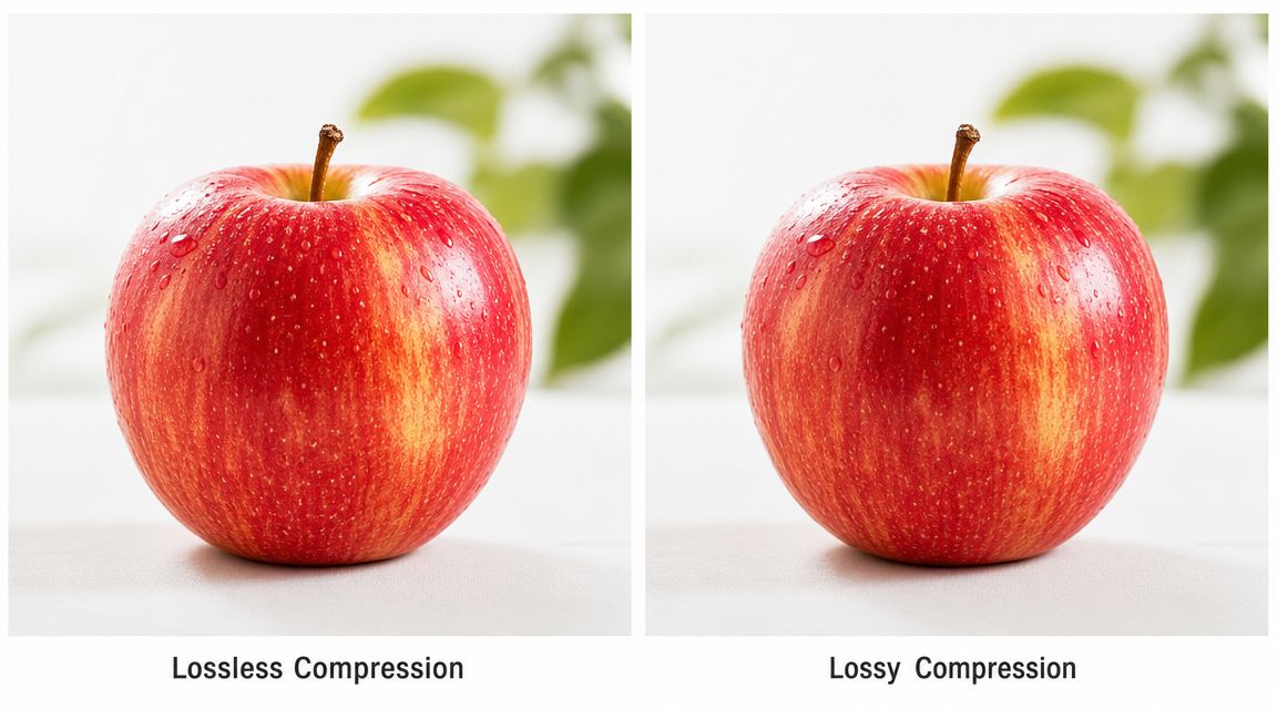
Think of lossy compression like packing for a trip and leaving behind items you probably won't miss. You travel lighter, and if you packed well, nobody notices what's gone. That's usually fine for product photos.
Lossless compression is more like folding everything better into the suitcase. Nothing is removed, but the savings are smaller. That's better for logos, icons, and graphics with text where crispness matters.
The mistake isn't choosing lossy. The mistake is crushing files until surfaces look smeared, edges get fuzzy, or product texture disappears. If a shopper can't inspect the thing you're trying to sell, you've optimized the wrong way.
What to compress yourself and what to leave to Shopify
Shopify helps, but it isn't a substitute for judgment. If you upload a bloated source file, Shopify can't magically make it a perfectly prepared storefront asset.
Use a workflow like this:
- Resize first: Don't compress a file that's much larger than needed.
- Choose the right source format: JPEG for most photos, PNG for transparent assets, WebP when it fits your workflow.
- Compress before upload: Tools like TinyPNG, Squoosh, and ImageOptim are useful for manual control.
- Keep originals offline: You'll want a clean source if you need to re-export for a new theme or campaign.
- Use Shopify apps for bulk cleanup: This matters when the catalog is already large and inconsistent.
Here's a quick visual primer on the compression trade-off:
If you manage a big catalog, don't try to manually perfect every image forever. Set thresholds, test hero products first, then roll the workflow across the rest of the store. That's how this becomes sustainable instead of a one-week cleanup that falls apart on the next product launch.
Mastering Image SEO and Alt Text at Scale
A 20-product store can get away with sloppy image metadata for a while. A 2,000-product store cannot. Once catalogs grow, image SEO stops being a copy task and becomes an operations problem.
File names still matter
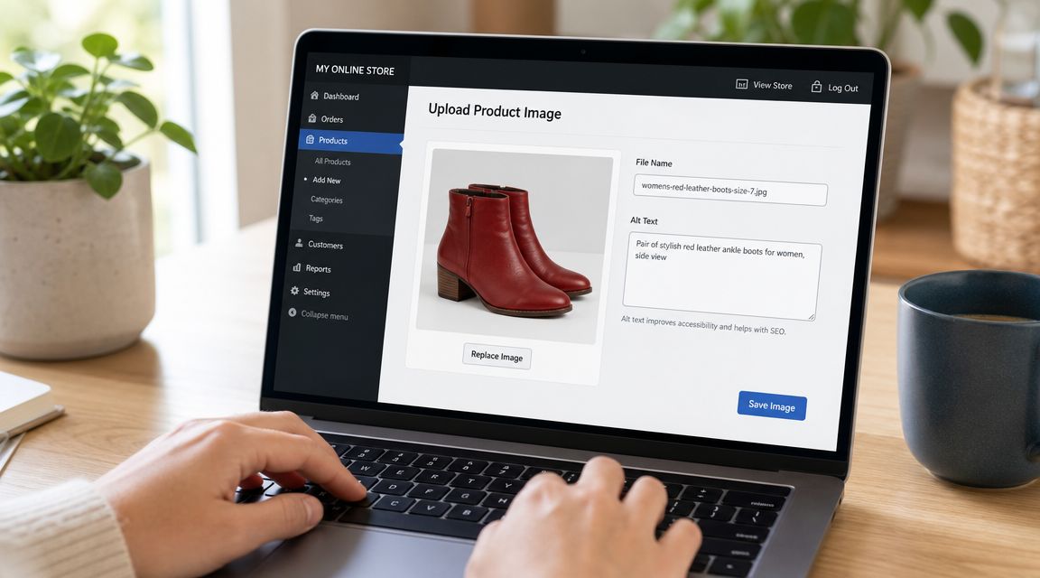
Shopify keeps the file name in the asset URL, so bad inputs stay visible. If your team uploads IMG_4839.jpg, final-v2.png, or supplier exports with random strings, you lose context for search engines and create a mess for anyone managing the library later.
Use file names that are:
- Specific:
black-leather-crossbody-bag.jpg - Readable: lowercase with hyphens
- Relevant: based on what the image shows
- Consistent: especially across variants, angles, and product families
The practical rule is simple. Name the image for the product and the view, not for the workflow that produced it. red-ceramic-mug-side-view.jpg is useful. DSC00452-edited-final.jpg is not.
Alt text fails first when teams try to scale it casually
Alt text is usually treated like a field someone will "fill in later." That works until the catalog gets large, multiple people touch the same products, and nobody agrees on what a good description looks like. Tapita's Shopify image optimization article highlights that operational problem and also summarizes the common guidance to keep alt text concise, descriptive, and generally under 125 characters while avoiding keyword stuffing: Tapita's Shopify image optimization article.
Alt text also has an accessibility job. It needs to describe the image in a way that helps someone using a screen reader understand what is there and what matters. If you need a baseline reference, WCAG 2.2 alt text compliance is a useful standard to check against.
A few examples make the difference clear:
| Situation | Weak alt text | Better alt text |
|---|---|---|
| Standard product shot | “bag” | “Black leather crossbody bag with gold chain strap” |
| Variant image | “red shirt” | “Men's red cotton t-shirt folded flat” |
| Lifestyle image | “woman wearing jacket” | “Woman wearing beige trench coat outdoors” |
| Decorative icon | “icon” | Use empty alt text if the image is purely decorative |
Alt text should describe the image. It should not repeat a target keyword just because an SEO checklist said every field needs one.
The harder part is governance. On large Shopify stores, the failure pattern is predictable. Merchandising copies the product title into every image. Agencies write one decent batch, then drift into templates. Marketplace imports bring in duplicates. Color variants end up with identical alt text even when the image changed. None of that helps accessibility, and very little of it helps image search.
The fix is to build rules your team can follow:
- Set templates by image type: hero image, variant image, close-up, lifestyle shot, packaging shot
- Define the inputs: product type, color, material, visible feature, and context if relevant
- Allow exceptions: bundles, multipacks, and comparison images need manual review
- Decide when alt should be empty: decorative graphics should not get fake descriptions
- Handle translation separately: translated alt text should sound natural in each market, not read like a literal export
This is the shift stores miss. Image optimization is not a one-time cleanup. It is a repeatable workflow with QA rules, ownership, and exception handling.
If the catalog is large, manual writing alone does not hold up for long. A practical approach is hybrid. Use structured product data and templates to generate a strong first draft, review the high-impact images manually, and monitor for duplicates, missing alt text, and nonsense outputs over time. That is how you keep image SEO useful across thousands of assets without turning the content team into a maintenance queue.
Implementing Lazy Loading and Responsive Images
Even a well-prepared image can hurt performance if you deliver it badly. Storefront rendering is therefore important. The file is only half the job. The browser experience is the other half.
Lazy loading is about priority
Lazy loading sounds technical, but the idea is simple. Don't load images the shopper can't see yet. If someone lands on a long collection page, the browser shouldn't rush to fetch every product tile all the way down the page before showing the first visible screen.
Just as when driving at night, you only need the stretch of road in front of you illuminated right now. Lighting the next several miles instantly would be wasteful.
That said, lazy loading isn't something to slap onto every image without thinking. Your primary above-the-fold image, especially the main product image or hero image contributing to first view, often deserves immediate priority. If you lazy load that asset carelessly, you can make the page feel slower instead of faster.
Check your theme output. Most modern Shopify themes already implement lazy loading for many offscreen images. If you inspect the rendered HTML and see loading="lazy" on image tags, your theme is at least doing the basics.
Responsive images stop mobile waste
Responsive images solve a different problem. A phone should not download the same giant image a wide desktop monitor might use. That's what srcset and related responsive delivery logic are for.
Google-centered performance guidance and current Shopify advice increasingly treat responsive images, lazy loading, and modern formats as core levers for mobile performance, particularly because mobile shoppers shouldn't be forced to download oversized desktop assets, as discussed in this Shopify-focused YouTube discussion on modern image delivery trade-offs.
Here's what to verify in your theme or custom section output:
- Check for
srcset: The browser should be offered multiple image widths. - Check for width and height attributes: These help prevent layout shift.
- Check for smart rendering on collection cards: Product tiles often hide waste because each image seems small on its own.
- Check app blocks and page builders: Third-party sections often bypass good theme defaults.
If a mobile user downloads a desktop-sized banner, your theme may look responsive, but your image delivery isn't.
For merchants working with developers, this is also where Shopify's image CDN and image URL sizing controls become useful. But even without touching code, you can still audit the output and catch obvious failures. That matters because many stores think they've optimized Shopify images when they've only cleaned the media library. If the theme still serves the wrong file to the wrong screen, performance leaks remain.
Testing and Monitoring Your Image Performance
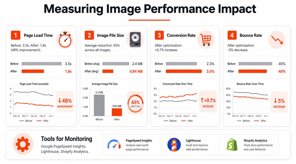
A store redesign goes live. The new homepage looks sharp on a desktop review. A week later, mobile bounce rate ticks up, product pages feel sticky, and nobody can say whether the problem is the hero banner, oversized product media, or an app block that started serving bad assets. That is why image optimization has to be treated as an ongoing workflow, not a one-time cleanup.
Testing matters because image problems hide in plain sight. A media library can look tidy while the storefront still ships oversized files, poorly compressed assets, or slow-loading LCP images on the pages that make money. Shopify stores with large catalogs feel this first. One bad upload is manageable. Hundreds of new SKUs, seasonal banners, and supplier images turn small mistakes into a system problem.
What to check in PageSpeed Insights
Run more than the homepage. Test your homepage, a top collection page, several product pages, and at least one page that uses a custom app block or page builder section. Image issues rarely hit every template the same way.
PageSpeed Insights is useful because it points to the type of waste, not just the score. The warnings that usually matter are:
- Properly sized images: the page is sending files larger than the layout needs.
- Efficiently encode images: compression is weak, or the source file was exported badly.
- Serve images in modern format: older formats are still carrying work better-suited to newer ones.
- Largest Contentful Paint context: the main above-the-fold image is arriving too late and dragging perceived load time with it.
The main mistake is treating all warnings as equal.
If your hero image or primary product media is delaying the first useful view, fix that before touching low-value assets like decorative badges, footer graphics, or tiny icons. Revenue pages deserve the first pass. Lab tools are there to help you prioritize, not to send you on a scavenger hunt.
Build a monitoring process that survives catalog growth
Image performance slips when nobody owns it after launch. Merchandisers upload supplier photos. Marketing swaps in campaign creatives. Developers add a new section that bypasses existing theme logic. The store gets slower in pieces, and no single change looks serious enough to trigger a full audit.
A workable review rhythm is simple:
- Check key templates on a schedule: homepage, collection, product, and landing pages tied to paid traffic.
- Retest after launches: new themes, seasonal campaigns, app installs, and section updates are common break points.
- Watch for repeat warnings: if the same issue keeps returning, the problem is process, not one file.
- Test on a real phone: reports catch patterns. Real devices catch friction, like a gallery that feels slow even when the score looks acceptable.
- Keep a short list of image owners: someone should be responsible for upload standards, naming, compression, and approvals.
For large catalogs, manual spot checks eventually stop being enough. At that point, the job shifts from fixing individual images to controlling the workflow around them. That usually means setting rules for asset creation, standardizing exports, and using automation where scale makes manual review unrealistic, especially for repetitive tasks like alt text generation, compression checks, and recurring performance monitoring.
That is how optimized Shopify images stay optimized.
Shopify Image Optimization FAQs
Does Shopify automatically optimize images
Partly. Shopify helps with delivery and modern-format serving in supported environments, but it doesn't replace pre-upload sizing, thoughtful compression, strong file names, or good alt text. If you upload messy assets, automation won't turn them into a disciplined media system.
Should I still use JPEG and PNG
Yes, but selectively. JPEG is still useful for standard photos in upstream workflows. PNG still has a job when transparency matters. The mistake is treating those legacy defaults as the whole strategy instead of deciding based on image purpose and storefront context.
Do I need an image optimization app
Not always. Smaller stores can do a lot manually if the team is disciplined. Larger catalogs usually benefit from apps because the main issue becomes consistency, bulk processing, and ongoing monitoring rather than one-off edits.
What should I do with old unoptimized images already in my store
Start with the pages that matter most. Fix your homepage visuals, best-selling product pages, and core collections first. Don't try to rebuild the entire library in one pass unless your team has the capacity and a clear workflow.
Will smaller images look bad on retina screens
Not if you export intelligently. The common guidance is to prepare images at the actual display size or roughly double that for retina displays, rather than uploading giant originals that browsers must shrink. Sharpness comes from fitting the storefront use case, not from hoarding unnecessary pixels.
How do I handle alt text for huge catalogs
Don't rely on ad hoc manual entry. Set rules by image type, use structured naming inputs, and review exceptions. The stores that do this well treat alt text as product metadata, not as a random SEO field someone fills when they remember.
If you want help turning all of this into a repeatable system, wRanks is built for Shopify teams that need more than a checklist. It can help audit image issues across your store, generate descriptive alt text at scale, and keep SEO work tied directly to the pages and products your team manages.

About James Rodriguez
AI & GEO specialist helping brands maximize visibility across AI platforms like ChatGPT, Gemini, and Claude. James pioneers generative engine optimization techniques for e-commerce.