Unlock Growth: Best Shopify Forms App Guide 2026

Most Shopify stores already have a way for people to contact them. That isn't the same as having a form strategy.
A basic contact page usually catches only the small group of visitors who are motivated enough to hunt for it, fill it out, and wait. Everyone else browses, hesitates, and leaves. That traffic often contains future email subscribers, wholesale leads, repeat buyers, and product feedback you never capture.
That's why the Shopify Forms app matters. Not because forms are glamorous, but because they sit at the point where attention becomes data. If you treat that moment well, you build a list, enrich customer profiles, and create cleaner follow-up marketing. If you treat it casually, your store becomes a revolving door.
Table of Contents
- Your Store Is Leaking Data and You Might Not Know It
- Understanding the World of Shopify Form Apps
- Essential Form Use Cases That Drive Growth
- How to Choose the Right Forms App for Your Store
- Implementing Your First Form The Smart Way
- Advanced Strategies and Common Pitfalls to Avoid
- Measuring Form Success and Optimizing Performance
Your Store Is Leaking Data and You Might Not Know It
A new store owner usually notices the leak late. Traffic is coming in. Some people add to cart. A few customers buy. But most visitors disappear without leaving a trace.
The store has a contact page, maybe even a newsletter field in the footer. On paper, that sounds fine. In practice, it's passive. It asks the visitor to do the work of finding you, trusting you, and deciding what to say. Most won't bother.
That's the leak. Not just lost email signups, but lost intent.
When a shopper lands on a product page, compares options, and still isn't ready, a form can catch that hesitation and turn it into something useful. A popup for first-time subscribers, an inline wholesale inquiry on a collection page, or a request form for restock alerts can keep the relationship alive instead of ending the session cold.
Too many apps, not enough strategy
Part of the confusion is scale. The Shopify App Store had 17,600+ apps as of April 2026, and independent app-store tracking also noted 50%+ year over year growth in app count, which tells you how crowded the decision environment has become (Shopify app ecosystem statistics).
That abundance is useful, but it also pushes merchants into the wrong question. They ask, “Which app has the most features?” when they should ask, “What customer intent am I trying to capture?”
A form isn't a website accessory. It's a handoff point between browsing and relationship-building.
There's another angle store owners miss. Every form collects customer information, and that means your process should be thoughtful about what you ask for, why you ask for it, and where that data lives. If you need a plain-language primer on the broader risks around exposed customer information, this breakdown of data breach insights for MSPs is useful because it explains the core issue clearly even outside an eCommerce context.
A good form strategy does three things at once:
- Captures intent: It gives uncertain visitors a lower-friction next step than “buy now.”
- Improves segmentation: It helps you distinguish wholesale prospects, subscribers, support requests, and high-intent product questions.
- Creates follow-up paths: It turns one anonymous session into future email, automation, or sales outreach.
That's why forms are a growth lever. They don't just collect messages. They create usable demand.
Understanding the World of Shopify Form Apps
Most merchants lump everything into one bucket and call it a “form app.” That's too broad to be useful.
There are really two categories. First, you have Shopify's own native Forms app. Second, you have the wider group of third-party form builders in the app ecosystem. Both can be right. They just solve different problems.
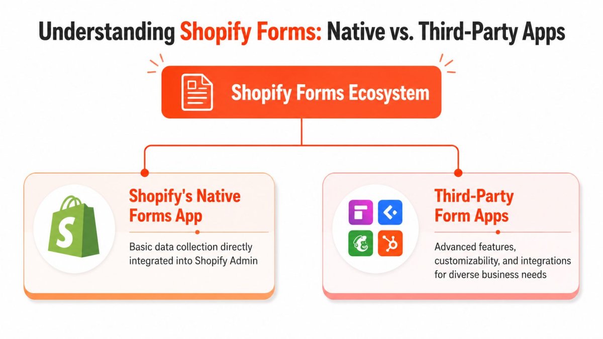
Native first or specialist first
Think of Shopify's native app like the tools built into a good Swiss Army knife. They're close at hand, integrated, and practical. A specialist app is more like bringing a dedicated workshop tool. It often does more, but only matters if you need that extra range.
Shopify's native Forms app is designed to turn store visitors into leads and subscribers with inline and pop-up forms, including wholesale lead capture, subscriber sign-ups, and other business-data collection. It also lets merchants manage submissions, email notifications, and customer segments directly in Shopify admin (Shopify Forms app listing).
That native integration is its main attraction. You're not stitching together a loose stack of tools just to collect names and emails. For many stores, especially early-stage DTC brands, that's enough to get moving.
What Shopify Forms is built to do well
The Shopify Forms app works best when your goal is straightforward first-party data capture that stays inside Shopify's ecosystem.
Use it when you want:
- Subscriber growth: Inline or popup forms tied to list building.
- Wholesale lead intake: A clean first step for retail partners or stockist interest.
- Basic segmentation: Different forms for different audience intents.
- Shopify-native workflows: Submissions that stay close to your customer records and marketing setup.
Where merchants get tripped up is assuming “form app” always means “anything I can imagine.” It doesn't.
If you need more advanced behavior, such as complex branching logic, unusual integrations, highly customized layouts, or workflows that push data into non-Shopify systems first, a third-party app may fit better. That doesn't make the native app weak. It means the tool is opinionated.
Practical rule: Start with the simplest app that supports your actual business process. Upgrade when your workflow breaks, not when a feature list impresses you.
A lot of bad app decisions come from buying complexity too early. If you're running a straightforward subscriber capture program, a native tool is often cleaner. If you're building a multi-step wholesale application with custom routing and external review, you'll probably outgrow it.
The best choice isn't the app with the longest feature page. It's the app that matches the path your customer needs to take.
Essential Form Use Cases That Drive Growth
A form becomes valuable when it sits inside a real commercial workflow. Not when it exists because “every site should have one.”
The strongest setups usually fall into two camps. Some forms generate demand. Others reduce operational drag. The best stores use both.
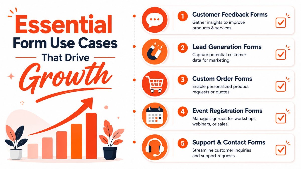
Lead capture that feeds real marketing
A classic DTC use case is the first-visit email capture form. Done badly, it's an annoying popup that appears too early. Done well, it offers a relevant incentive, appears at the right moment, and sends the subscriber into a useful follow-up flow.
Shopify Forms supports popup and inline forms, can tag new customers, and connects captured leads to Shopify-native marketing workflows such as segmentation and automations, which makes it useful when you want a direct path from signup to list growth and follow-up campaigns (Shopify Forms workflow overview).
That matters because the form itself isn't the win. The sequence after submission is the win.
A few strong examples:
- A DTC apparel store: Uses a popup for first-time visitors with a signup incentive, then tags those subscribers for a welcome sequence.
- A skincare brand: Places an inline form on a quiz or education page to collect leads from shoppers who need more trust before buying.
- A wholesale-focused brand: Uses a dedicated lead form so retail buyers don't end up in the same path as consumer subscribers.
If your product page isn't doing enough to convert cold traffic before the form even appears, it's worth tightening the page itself. This guide to Shopify product page optimization pairs well with form strategy because better page clarity usually improves the quality of the leads you collect.
Operational forms that save team time
Forms also solve messy back-office problems.
A support team can use structured contact forms to route product issues, shipping questions, or return requests more cleanly than a generic inbox can. A custom order business can use a quote request form to screen serious buyers before anyone books a call. A workshop or event-driven store can use a registration form instead of juggling DMs and email threads.
Here's the shift that matters:
| Use case | Weak version | Strong version |
|---|---|---|
| Subscriber capture | Footer signup no one notices | Targeted popup or inline form tied to segmentation |
| Wholesale inquiries | Generic contact page | Dedicated lead form with qualification questions |
| Support requests | One inbox for everything | Structured form with issue-specific fields |
| Custom orders | Back-and-forth emails | Quote form that collects requirements upfront |
Stores usually don't need more traffic first. They need better capture points for the traffic they already have.
When you use forms this way, you stop measuring them as admin tools. You start measuring them as sales support, lifecycle marketing input, and customer insight collection.
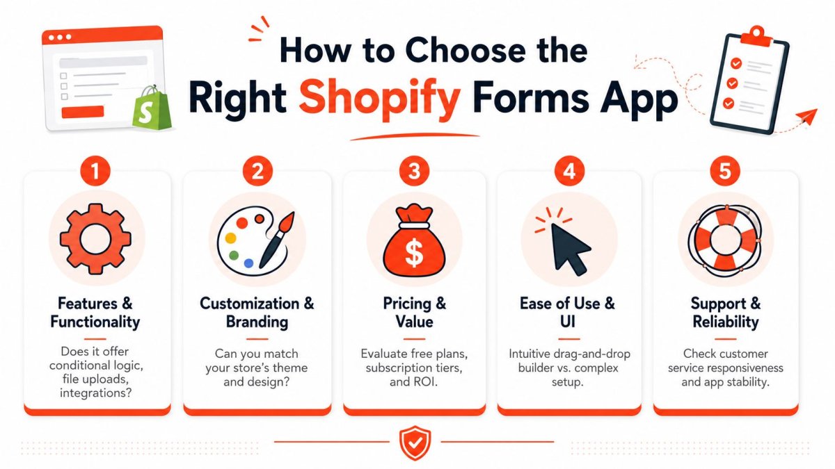
How to Choose the Right Forms App for Your Store
Choosing a forms app gets easier when you stop shopping by screenshots.
Most merchants compare interfaces, pricing tables, and review counts. That's understandable, but it often leads to the wrong fit. The app should be selected around your business model and your data flow, not around which demo looks the nicest.
Take a minute with this visual checklist before you decide.
Start with your business model
A DTC store selling a narrow product line usually needs simple subscriber capture, light segmentation, and low-friction forms. A wholesale-heavy store needs qualification. A custom-product business needs richer intake. A service-led brand may need booking-adjacent lead collection.
That's why “best Shopify Forms app” is the wrong phrase to optimize your thinking around. The better question is, “What process am I trying to support?”
Use this quick lens:
- If you sell mainly DTC: Prioritize popup and inline capture, simple setup, and clean integration with your customer records.
- If wholesale matters: Look for room to ask qualification questions without creating too much friction.
- If you sell custom or made-to-order products: Focus on flexibility, file collection if needed, and better intake structure.
- If support volume is growing: Choose forms that help classify requests so your team isn't sorting chaos manually.
For a broader framework on vetting app quality before installation, this guide for Shopify app selection is worth reading because it pushes you to evaluate fit, not just features.
A walkthrough can also help when you're narrowing options and trying to compare setup effort against capability.
The five questions that prevent bad app choices
Some criteria matter more than others. I'd put them in this order.
| Question | Why it matters | Red flag |
|---|---|---|
| Will it fit my workflow? | A form should match how you sell, support, or qualify leads. | You're bending your process around the app. |
| Can I brand it without hassle? | Design mismatch lowers trust and creates rework later. | Styling requires brittle hacks for basic changes. |
| Where does the data go? | Form value depends on what happens after submission. | Submissions get trapped or need manual exporting. |
| Does it feel light to use? | Clunky admin and poor UX kill adoption. | Your team avoids using it after setup. |
| What's the real cost over time? | Cheap tools become expensive if they create manual work. | You save on fees but lose hours in operations. |
A few practical filters help:
- Check integrations early: Don't assume your email, CRM, or helpdesk workflow will connect the way you expect.
- Review mobile behavior: A form that looks acceptable on desktop can be frustrating on mobile.
- Inspect editing limits: Changing fields is easy. Matching a branded experience is often harder.
- Ask who owns maintenance: If every update needs developer time, your “simple form” isn't simple.
- Price against outcomes: Monthly cost is only one part of the equation. The question is whether the app saves labor or improves lead quality.
The strongest choice is usually the one your team can maintain without dreading it.
Implementing Your First Form The Smart Way
The first form shouldn't go live just because it looks finished. Placement, timing, and the amount of friction matter more than color choices.
Too many stores launch a popup immediately on every page and then wonder why it feels intrusive. The problem usually isn't the form. It's the interruption pattern.
Choose placement before design
Use the form type that matches the moment.
An inline form works well when the visitor is already in a context where the ask makes sense. Think wholesale application sections, restock request areas, educational landing pages, or custom quote pages. It feels like part of the experience.
A popup works better when you need to create a clear decision moment. It's useful for subscriber capture, but only when the trigger respects attention.
A practical starting playbook:
- Homepage or collection traffic: Use a popup only after the visitor has engaged at least a little.
- Product pages: Keep the ask relevant. Subscription, back-in-stock, or related interest usually works better than a generic newsletter pitch.
- Wholesale pages: Use inline forms so the visitor feels like they're continuing a process, not being interrupted.
- Support or returns pages: Dedicated forms beat popups every time.
If the form appears before the shopper understands your offer, you're asking for commitment before earning interest.
Keep the first ask small
Most stores ask for too much information too early. That's especially common with wholesale and custom requests.
The better pattern is staged capture. Ask for the minimum needed to identify and route the lead first. Then collect deeper detail later, either in follow-up communication or in a second step if the intent is strong enough.
A smart launch checklist looks like this:
- Define the single job of the form: Email signup, wholesale inquiry, support routing, quote request, or feedback.
- Remove any field that doesn't change an action: If you won't use the answer, don't ask for it.
- Set one clear trigger rule: Time on page, scroll depth, page type, or manual placement.
- Write a specific promise: “Get updates” is weak. “Get early access to launches” is clearer.
- Connect the follow-up before launch: A dead-end confirmation message wastes the submission.
Stores that implement forms well treat them like product UX. The form should feel like the next logical step, not a trap door.
Advanced Strategies and Common Pitfalls to Avoid
The most common complaint about the Shopify Forms app isn't setup. It's design control.
Merchants assume they'll be able to tweak the form with normal theme CSS, match spacing and radius exactly, and move on. Then they hit a wall. That wall is technical, not personal.

Why styling gets frustrating fast
Shopify Forms is implemented via the Shadow DOM, which means you can't reliably style internal fields with ordinary theme CSS. The supported path is using CSS custom properties on the host element, which is the key limitation for merchants and developers who want deep brand integration (Shopify Community discussion on Shopify Forms styling).
That sounds technical, but the practical meaning is simple. You can't assume your usual CSS approach will reach inside the form component.
What works:
- Use exposed custom properties: If Shopify exposes a variable, use it.
- Adjust layout at the host level: Width and spacing changes are more reliable there.
- Design within the system: Aim for “brand-consistent enough” unless your store demands pixel-perfect matching.
What usually doesn't work:
- Deep selector hacks: They tend to break or fail because the internals are isolated.
- Theme-level guesswork: Inspecting classes and forcing styles is brittle.
- Expecting native controls to cover every branding detail: They won't.
Merchants call styling “impossible” when the real issue is that they're trying to use the wrong layer of control.
If brand presentation matters heavily, that limitation should be part of app selection from day one. If speed matters more than perfect visual parity, the trade-off may be acceptable.
And if storefront performance is already under pressure, be careful with any app stack that adds more front-end complexity than your store can comfortably carry. This guide on how to optimize Shopify speed is useful when you're evaluating whether another visual tool is worth the extra load.
Smarter targeting and cleaner governance
The other missed area is operational discipline after launch.
A form shouldn't appear everywhere for everyone. Better stores target forms by page type, device context, and user intent. A popup on mobile may need a different threshold than the same popup on desktop. A wholesale form belongs where wholesale intent is strongest. A support form should route requests clearly so your team doesn't inherit a cleanup problem.
A few advanced habits help:
- Segment by intent: Don't send support requests, subscriber signups, and wholesale leads into one bucket.
- Control interruption carefully: Mobile users have less patience for aggressive popups.
- Review spam protection options: Any public form can attract junk submissions, so use available anti-spam controls where possible.
- Test the offer, not just the design: Headline, timing, incentive, and field count often matter more than visual polish.
- Create ownership internally: Someone should be responsible for reviewing submissions and acting on them.
Strong form governance is quiet work. Customers barely notice it. Your team notices it every week because the data is cleaner and the follow-up is easier.
Measuring Form Success and Optimizing Performance
A form that collects submissions but doesn't influence revenue, retention, or customer insight is only half successful.
The first mistake is obsessing over raw submission count. That number can flatter you. It doesn't tell you whether the form is attracting qualified interest, helping your lifecycle marketing, or creating better customer records.
Track business outcomes not just submissions
Look at form performance through a sequence:
- View to submission: Are people seeing the form and deciding it's worth completing?
- Lead quality: Do the submissions reflect the audience you wanted?
- Lead to customer movement: Are subscribers, wholesale leads, or inquiries turning into actual commercial outcomes?
- Operational usefulness: Does the form reduce confusion, support friction, or manual admin work?
If a popup gets plenty of signups but those contacts never engage, the issue might be the offer, the targeting, or the audience match. If a wholesale form gets few submissions but most are serious, that form may be doing its job very well.
Optimization usually starts with friction
One recurring issue is design alignment. Public guidance around matching Shopify Forms to store branding is still workaround-heavy, and merchants often run into frustration when trying to make forms feel native to their design system (Shopify Forms design frustration discussion).
That's why optimization often begins with small friction audits:
- Is the ask clear enough?
- Does the timing feel earned?
- Is the number of fields justified?
- Does the form look trustworthy in context?
- Does the follow-up sequence match the promise?
If you want clearer reporting around the path from store traffic to form-driven actions, this guide to Shopify GA4 setup and analysis can help you connect on-site behavior with the downstream outcomes that matter.
The stores that win with forms don't “set and forget” them. They treat forms like living conversion assets. They adjust the offer, placement, styling, and follow-up until the form earns its place on the site.
If you want to improve how your Shopify store attracts traffic and turns that attention into measurable growth, wRanks gives you one place to handle SEO content, technical fixes, structured data, indexing, and visibility tracking built specifically for Shopify. It's a practical fit for merchants who want faster execution without adding theme bloat.

About Priya Sharma
Content marketing expert and Shopify ecosystem authority. Priya has helped 200+ stores grow organic traffic through strategic blog content and keyword targeting.