Shopify Product Description Drop-Down Menu
Optimize your Shopify product pages with a drop-down menu that keeps key buying details visible and organizes supporting info effectively.
You open a product page during a busy afternoon and spot the problem immediately. Shipping details sit below a long description, sizing guidance takes too much scrolling, and you can't tell whether the latest theme change helped shoppers or weakened search visibility. A Shopify product description drop-down menu may help organize that information, but only if the main buying details remain easy to find.
Most Shopify stores don't have a product-description length problem. They have an information-structure problem. Your product's main promise and essential buying details should stay visible, while supporting information can move into expandable rows.
Start by separating visible essentials from secondary details. Then use Shopify and wRanks to review usability, crawlability, meta tags, structured data, and other search signals without hiding information buyers or search engines need.
Use Drop-Downs for Supporting Details, Not the Information Buyers Must See
You can make a Shopify product page look shorter without making the buying decision easier. When specifications, fit guidance, shipping terms, or return details disappear behind a menu, you may save scrolling while making customers work harder.
The narrow query “Shopify product description drop-down menu” has 10 monthly searches in the keyword research behind this guide. That figure describes a specific search need, not broad demand or guaranteed traffic. The bigger opportunity is clearer content structure: keep essential information visible, then use expandable rows for useful supporting detail.
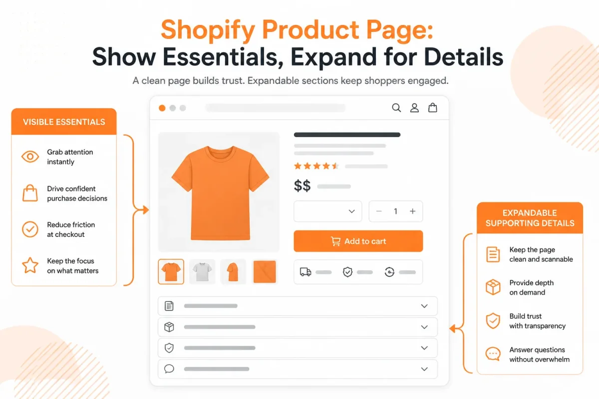
How do you keep purchase-critical facts above the fold
Your visible product area should explain what the item is, why it matters, and what a buyer must know before purchasing. Use the checklist below before moving any content into a drop-down.
- Product promise: Your opening copy names the product and its main customer benefit, such as “A lightweight linen shirt that stays cool on humid summer days.”
- Primary benefits: Your visible content gives buyers the strongest reasons to choose the item, not vague claims such as “premium quality.”
- Purchase facts: Your price, key variant information, availability, and the most important delivery or return condition remain easy to find.
- Decision blockers: Your customers can see any fact that could stop a purchase, including material limits, sizing warnings, or compatibility requirements.
Practical rule: Keep the product promise, primary benefits, and critical purchase information visible, while placing supporting detail in expandable rows.
What supporting details belong in expandable rows
Use rows for information customers may need after the main selling point is clear. Suitable sections include product specifications, fit, care, shipping, returns, and FAQs. This gives your page structure without burying the facts that help someone decide. The same approach suits specialized product catalogs, where Endodetex provides an example of a focused product-information destination.
Weak version: “Details” hides the product’s fabric, measurements, and care instructions under one unclear label.
Strong version: “Materials, fit, and care” tells shoppers exactly what they will find, while “Shipping and returns” separates purchase policies from product information.
For a broader checklist, see our Shopify SEO guide before you reorganize product-page content.
How do you check visible content before SEO
A Shopify product description drop-down menu doesn't automatically improve rankings. First, check whether your visible copy answers the buyer's main question. Then use wRanks to review page content and SEO signals, including meta tags, structured data, and related keyword coverage. That review supports better optimization, but it can't replace clear product information.
“Supporting details suitable for expandable rows include product specifications, fit, care, shipping, returns, and FAQs.” The supplied product-content guidance sets a practical boundary for your page structure.
Add the Product Content and Collapsible Rows in the Theme Editor
Start with product content that gives shoppers the main answer before they open anything. In a modern Shopify OS 2.0 theme, you edit that copy in Shopify admin, then arrange supporting details in the theme editor.
Keep the visible summary short and specific. The finished page should show the product description first, followed by labeled rows for details such as materials, sizing, care, shipping, or returns.

Add or edit the product description in Shopify admin
Open the product in Shopify admin and edit its Description field before changing the layout. Your visible copy should identify the product, its main benefit, and the key buying detail.
Weak: “Premium bottle for everyday use.”
Made for daily carry: “The 24 oz TrailSip insulated bottle keeps drinks cold for up to 24 hours, with a leak-resistant lid and powder-coated grip.”
Add a product description in Shopify
Open Products in Shopify admin, select the product, enter copy in Description, and save it. A common mistake is adding details only to a collapsible row, leaving the main description too thin for shoppers and search systems.
Open Products > Default product in the theme editor
From Shopify admin, open Online Store > Themes > Customize, then select Products > Default product. You are editing the product-page template, not the store header.
Add a drop-down to a Shopify product page
Add a drop-down on a Shopify product page by adding a Collapsible row block inside the product information section. If you edit Header instead, you'll create a navigation drop-down that appears across the store, not a product-page accordion.
Insert and label each Collapsible row
Select Add block, choose Collapsible row, and give each row a clear label. Enter text directly or connect the row to the relevant product content source.
Weak: “Details” with a blank row.
Materials and care: “Made from BPA-free stainless steel. Hand-wash the lid and let all parts dry before storage.”
Add a collapsible product description section in Shopify
Add a collapsible product description section by inserting a Collapsible row under the visible product description and assigning supporting copy to it. Don't hide the product name, primary benefit, price, or essential fit information inside that row.
Create a product-page drop-down
Create a product-page drop-down by adding a Collapsible row in Products > Default product. A nested menu under Navigation is different: it organizes header links and doesn't expand content on an individual product page.
Add content to a drop-down menu
Type information into the row's content field or connect an available source, then save the theme. Use one topic per row so your labels stay scannable.
- Visible summary: Your main description answers the product's central buying question.
- Clear labels: Each row names its contents, such as “Sizing” or “Shipping and returns.”
- Correct template: Products > Default product shows the intended product layout.
- Mobile check: Your rows open, close, and remain readable on a phone-sized preview.
Preview the product page and verify visible content
Preview the product page in desktop and mobile states before publishing. You should see a useful summary followed by labeled supporting rows, without clipped text or misplaced sections. Checking only desktop can hide cramped labels, difficult tap targets, or content that disappears on mobile.
Fix the Failures That Make a Shopify Product Accordion Unhelpful
A tidy Shopify product description drop-down menu can still leave shoppers unsure why they should buy. A hidden product promise, vague row title, or buried returns policy can make a polished page harder to use.
Start with diagnosis, not another theme setting. Check what shoppers see first, what mobile shoppers miss, and whether the content remains coherent for search engines after the change.
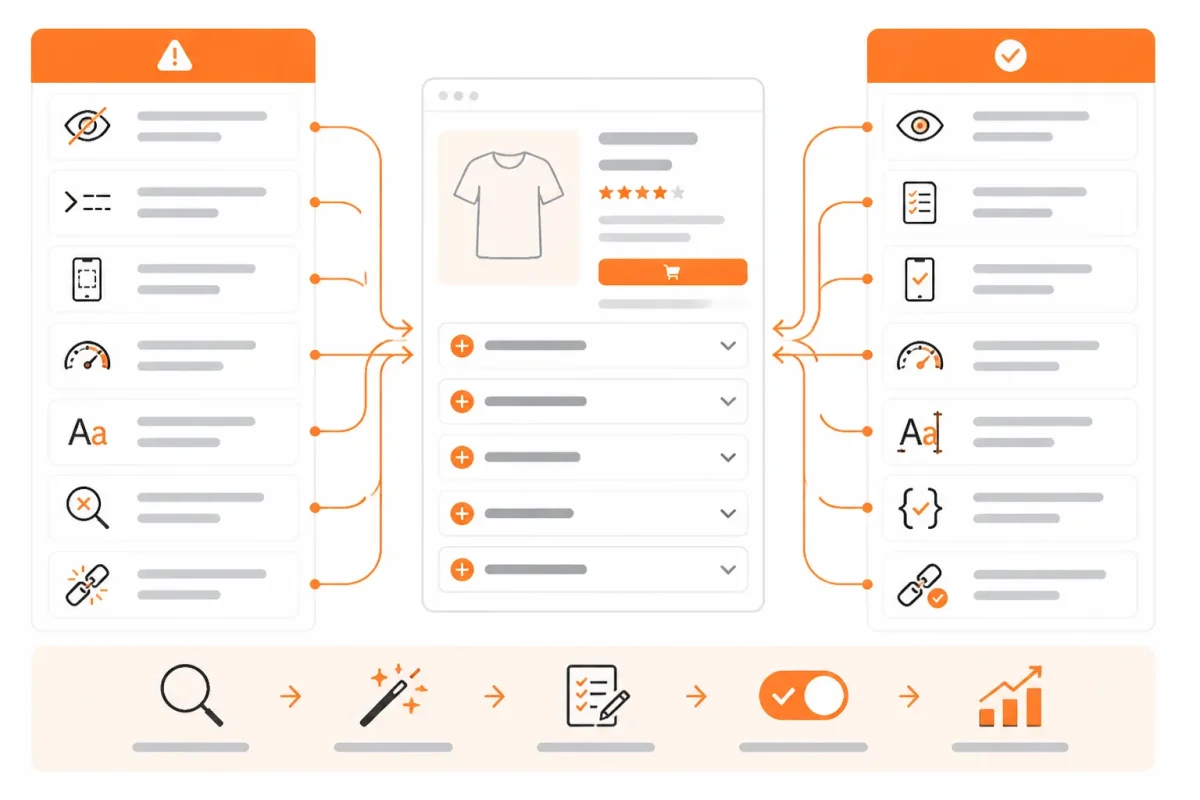
A blank or missing row usually signals a theme or template mismatch
If a row appears empty, disappears, or shows the wrong product information, you may have edited a different template or assigned content to the wrong block. Use the symptom to identify the first repair instead of rebuilding the entire accordion.
| symptom | likely cause | first fix |
|---|---|---|
| The main product value proposition is hidden inside a closed row. | The merchant treated the accordion as a replacement for the visible product summary. | Move the product promise and primary benefits into the visible description area. |
| Shoppers do not know what a collapsed section contains. | The row uses a vague label such as "More information." | Rename the row with a specific label such as "Materials and care" or "Shipping and returns." |
| Several rows contain nearly identical copy. | The same product information was pasted into multiple content areas. | Consolidate repeated content and give each row one clear purpose. |
| Mobile shoppers miss shipping or returns information. | Critical purchase details are placed in a low-visibility collapsed row. | Surface the most important policy information near the visible buying content and test the mobile layout. |
| The accordion is expected to improve rankings by itself. | A theme-editor layout change was confused with an SEO improvement. | Review crawlable page content and structured data in wRanks after publishing. |
A polished accordion can still hide purchase-critical information
- Visible promise: Keep "A lightweight rain jacket for daily commuting" above the closed rows, where you want every shopper to see it.
- Mobile hierarchy: Place key shipping and returns details near the buying area, then open the page on a phone-sized screen to check their position.
- Specific labels: Name the content directly. "Materials and care" tells you more than "More information."
Repeated or thin row copy weakens the product page
When you repeat the same benefits in Description, Details, and Materials, each row loses purpose. A thin row such as "High quality and comfortable" also adds little value for shoppers or search-focused content.
Weak example: "More information" followed by "This premium cotton hoodie is soft and comfortable."
Strong example: "Materials and care" followed by "85% organic cotton, 15% recycled polyester. Machine wash cold and lay flat to dry."
After publishing, use wRanks to inspect whether important product content and structured data remain present and coherent. wRanks can identify content and SEO issues, but an accordion alone doesn't guarantee rankings.
Answer the Remaining Shopify Menu Questions Without Losing the Product-Page Focus
“Dropdown menu” can refer to several Shopify features that work differently. Header navigation sends shoppers to collections, pages, or products, while a product-description accordion organizes supporting information on one product page.
Keep those structures separate when choosing a setup. Your product page needs useful details close to the buying decision, not a navigation system forced into the description.
Customize a drop-down menu in Shopify
Customize a Shopify header drop-down from Content, then Menus, where you can rename items, change destinations, and arrange child links beneath a parent. Your product-description accordion is separate and is usually edited through the theme editor or product template. Change the header menu for site navigation, not for specifications or care instructions.
Kim Kardashian's Shopify use isn't a setup criterion
You shouldn't use a celebrity's ecommerce platform as the basis for your product-page implementation. Whether Kim Kardashian uses Shopify isn't a reliable criterion for choosing header navigation, nested menus, or product accordions. Base the decision on your catalog structure, product information, mobile usability, and the content shoppers need before purchasing.
Examples of Shopify drop-down menus
Use header drop-downs for categories such as Women, Men, and Accessories, with collections beneath each parent. On a product page, useful accordion rows include Specifications, Fit and sizing, Care, Shipping, Returns, and FAQs. The first structure organizes destinations; the second organizes product evidence.
Create a drop-down menu planning sheet
Create a drop-down-menu sheet as a planning document with columns for the parent item, child link, destination, display label, and publishing status. Your sheet isn't a Shopify feature and isn't the same as a product-page accordion. Use it to map header navigation before editing Shopify, then manage product details within the relevant product template.
Add a submenu in Shopify
Add a submenu by opening your Shopify menu, creating or selecting a parent item, and placing related links beneath it in the menu hierarchy. The nested links then appear under that header destination. A product-description accordion doesn't create submenu links. It reveals text, specifications, or policies on the current product page instead.
Modify a drop-down menu
Modify a Shopify drop-down by editing its label, destination, order, parent item, or child links under Content and Menus. Check the result on mobile after saving. If you need to change product information, edit the accordion row or product content separately. Your header menu and product description have different jobs.
Apply the Five-Check Launch Sequence to One Shopify Product First
Your first test should expose problems before they spread across your catalog. Choose a product with a long description or frequent customer questions, so you can see whether shoppers find answers without losing the main selling point.
You don't need to redesign every product page today. Prove the content hierarchy on one Shopify product page, then use the rendered page, mobile layout, and SEO review to guide the wider rollout.
Choose one representative product page
Start with the Shopify product page that has the longest or most frequently questioned description. You'll learn more from a complex product than from a simple item with only two specifications.
Separate visible essentials from expandable support content
Write the visible essentials before adding any collapsible rows. Show the product's main benefit, best-use context, key specification, and primary buyer reassurance without requiring an extra tap.
Place supporting material in clearly labeled rows afterward. Use rows for detailed specifications, care instructions, shipping information, or warranty terms, while keeping the central selling point on the page.
Validate the live page before applying the pattern storewide
Use this five-check sequence to test the structure on one page:
- Choose the product: Start with the Shopify product page that has the longest or most frequently questioned description.
- Write visible essentials: Put the core benefit, important specification, and buying reassurance in the always-visible product content.
- Add supporting rows: Place secondary details in labeled collapsible rows without repeating or replacing the visible essentials.
- Test both layouts: Check the live page on desktop and mobile, including row controls, spacing, text readability, and the path to purchase.
- Review SEO signals: Use wRanks to inspect crawlable page content and structured data before applying the pattern to other products.
- Visible answer: You can understand why the product matters without opening a row.
- Clear support: You can identify each expandable row from its label alone.
- Mobile control: You can open and close rows without awkward scrolling or mis-taps.
- Search review: You can compare the rendered content and structured data in wRanks.
The goal isn't to hide copy or change your whole catalog at once. Once you've validated one page, turn its working structure into a repeatable template for similar products.
If you want a faster way to do this, wRanks helps Shopify stores review product-page SEO elements, structured data, meta tags, and related content through an AI-powered SEO platform. Its Shopify SEO guides and workflows fit merchants testing pages before scaling a proven structure.

Senior SEO strategist with 8+ years in e-commerce search optimization. Sarah helps Shopify merchants turn organic traffic into revenue through data-driven content strategies.